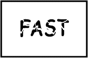
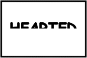
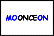
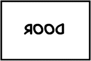
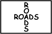
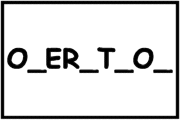
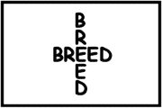
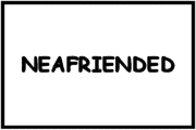
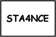
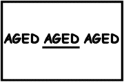
- The first one is Breakfast … Try to do the rest !!
- The first one is Breakfast … Try to do the rest !!
(1) I am not sure how many of you have noticed a hidden symbol in the Federal Express logo

Yeah, I am talking about the ‘arrow’ that you can see between the E and the x in this logo. The arrow was introduced to underscore speed and precision, which are part of the positioning of the company.

(2) The SUN Microsystems logo is a wonderful example of symmetry and order. It was a brilliant observation that the letters u and n while arranged adjacent to each other look a lot like the letter S in a perpendicular direction. Spectacular.
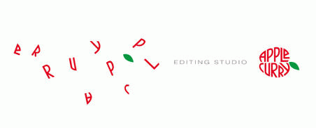
(3) The above logo is for an editing studio. I like the way the logo (apple shaped) attempts to convey what they do.
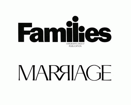
(4) The above are two magazines from the Readers Digest stable. Again, the attempt to communicate what it is about quite figuratively through the logo catches my attention.
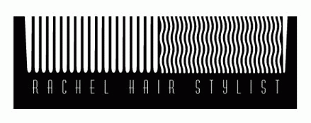
(5) I liked this logo of a hair stylist for the cheeky humour it brings to the (dressing) table.
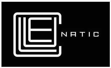
(6) This was a logo created for a puzzle game called Cluenatic. This game involves unravelling four clues. The logo has the letters C, L, U and E arranged as a maze. and from a distance, the logo looks like a key.
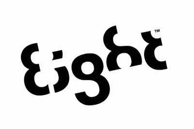
(7) This logo is too good. For the name Eight, they have used a font in which each letter is a minor adaptation of the number 8.
(8) Eighty-20 is a small consulting company which does sophisticated financial modeling, as well as some solid database work. All their work is highly quantitative and relies on some serious computational power, and the logo is meant to convey it.
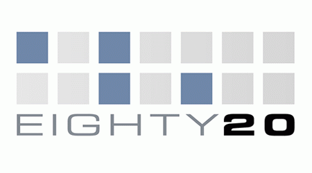
People first guess that 20% of the squares are darkened, but that turns out to be false after counting them. The trick is to view the dark squares as 1’s and the light squares as 0’s. Then the top line reads 1010000 and the bottom line reads 0010100, which represent 80 and 20 in binary. Kinda like the surreal green screen of The Matrix, they want us to read stuff in binary.
(9) This was a logo designed in-house for some internal event at IBM. I like that they are quite relaxed about the logo, unlike certain other companies who do not like the logo to be tampered with in any way even for internal promotions.

(10) You might think the arrow does nothing here. But it says that amazon.com has everything from a to z and it also represents the smile brought to the customer’s face. Wow, that is quite deep.
Jack and Max are walking from religious service. Jack wonders whether it would be all right to smoke while praying.
Max replies, “Why don’t you ask the Priest?”
So Jack goes up to the Priest and asks, “Father, may I smoke while I pray ?”
The Priest replies, “No, my son, you may not! That’s utter disrespect to our religion.”
Jack goes back to his friend and tells him what the good Priest told him.
Max says, “I’m not surprised. You asked the wrong question. Let me try.”
And so Max goes up to the Priest and asks, “Father, may I pray while I smoke ?”
To which the Priest eagerly replies, “By all means, my son. By all means. You can always pray whenever you want to.”
![]()
The moral of this story:
(when a maths teacher writes a love letter)
My Dear SweetHeart,
Yesterday, I was passing by your rectangular house in trigonometric lane.
There I saw you with our cute circular face,conical nose and spherical eyes,standing in your triangular garden.
Before seeing you my heart was a null set, but when a vector of magnitude (likeness) from your eyes at a deviation of theta radians made a tangent to my heart, it differentiated.
My love for you is a quadratic equation with real roots, which only you can solve by making good binary relation with me.
The cosine of my love for you extends to infinity.
I promise that I should not resolve you into partial functions but if I do so, you can integrate me by applying the limits from zero to infinity.
You are as essential to me as an element to a set.
The geometry of my life revolves around your acute personality.
My love, if you do not meet me at parabola restaurant on date 10 at sunset, when the sun is making an angle of 160 degrees, my heart would be like a solved polynomial of degree 10.
With love from your higher order derivatives of maxima and minima, of an unknown function.